Coriell Life Sciences
-
Coriell Life Sciences is a precision medicine company specializing in pharmacogenomic (PGx) testing and clinical interpretation. As the company expanded beyond a laboratory-focused model into broader enterprise and clinical healthcare settings, it needed a visual identity system that could support growth, credibility, and clarity across multiple audiences.
I led the logo design and brand identity, extending the system across packaging and trade show environments to ensure Coriell Life Sciences presented a confident, cohesive presence in an increasingly competitive genomics landscape.
-
Coriell Life Sciences was navigating a strategic shift, expanding from a laboratory-centric model into enterprise and clinical settings where clarity, trust, and accessibility are critical.
Their existing materials lacked cohesion and did not fully reflect the sophistication of their science or the human impact of their work. The brand needed to communicate complex genomic concepts in a way that felt modern, credible, and approachable, while standing out in a crowded precision medicine landscape.
-
I developed a comprehensive visual identity system rooted in precision, credibility, and human impact.
The work began with brand positioning and logo design, establishing a strong foundation that could scale across physical and digital environments. From there, I translated the brand into tangible applications that would be seen by clinicians, partners, and stakeholders in high-visibility contexts.
Key focus areas included:
Creating a logo system that conveyed scientific rigor without feeling cold or overly technical
Establishing a visual language that balanced innovation with trust
Designing packaging and trade show materials that clearly communicated value while remaining visually distinct in competitive environments
-
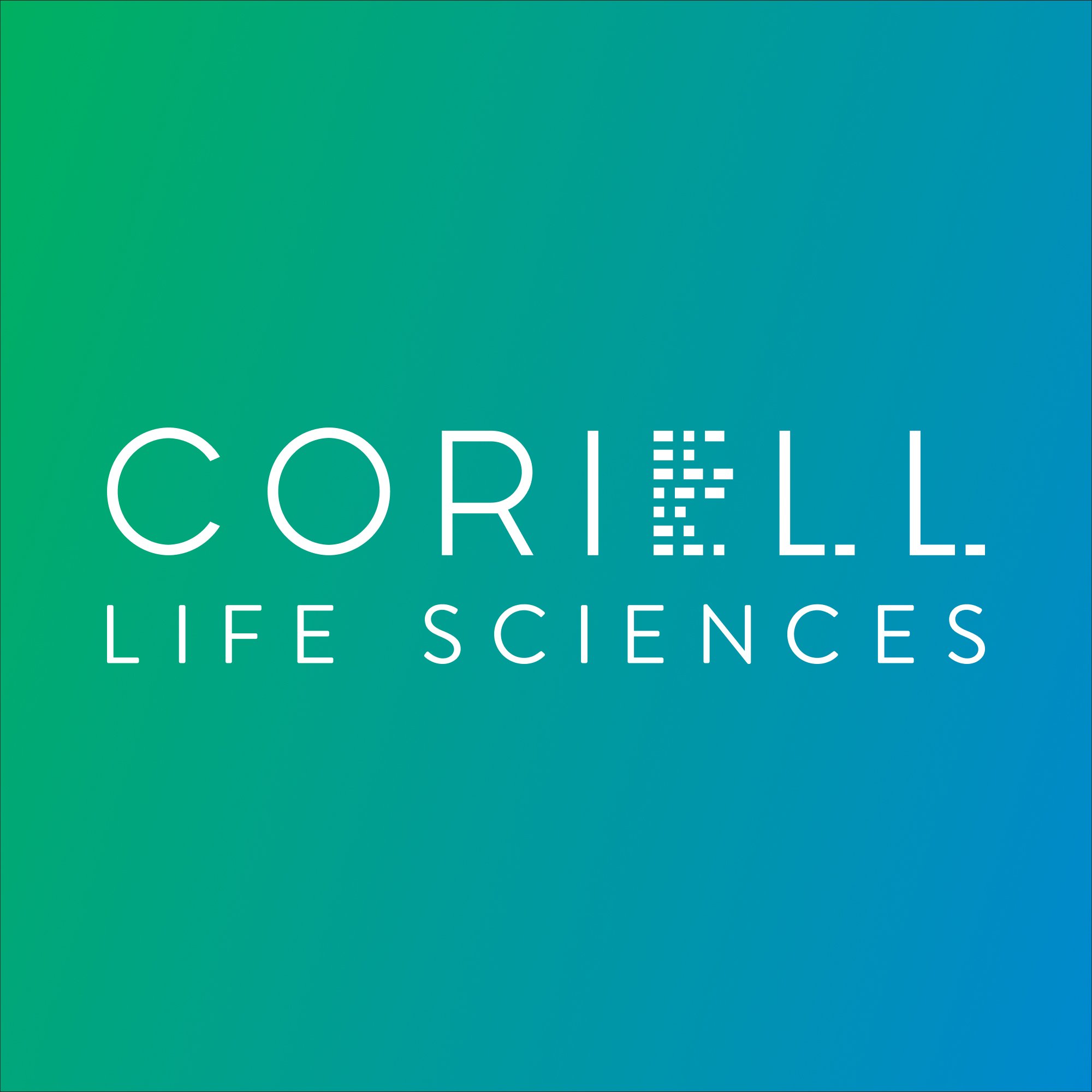
The Coriell Life Sciences logo was intentionally designed to balance scientific precision with approachability. The wordmark features a custom, abstracted “E”, created to subtly reference data structures and DNA sequencing, a visual nod to the company’s foundation in genomics and data-driven medicine.
Rather than relying on literal scientific symbols, the logo uses abstraction and proportion to convey intelligence, credibility, and modernity. This approach allows the identity to feel sophisticated and enduring, while still signaling Coriell Life Sciences’ role in translating complex genetic data into meaningful clinical insights.
The broader identity system reinforces these principles through a refined color palette, clear typographic hierarchy, and disciplined layout rules, ensuring consistency across digital, print, packaging, and environmental applications.
-
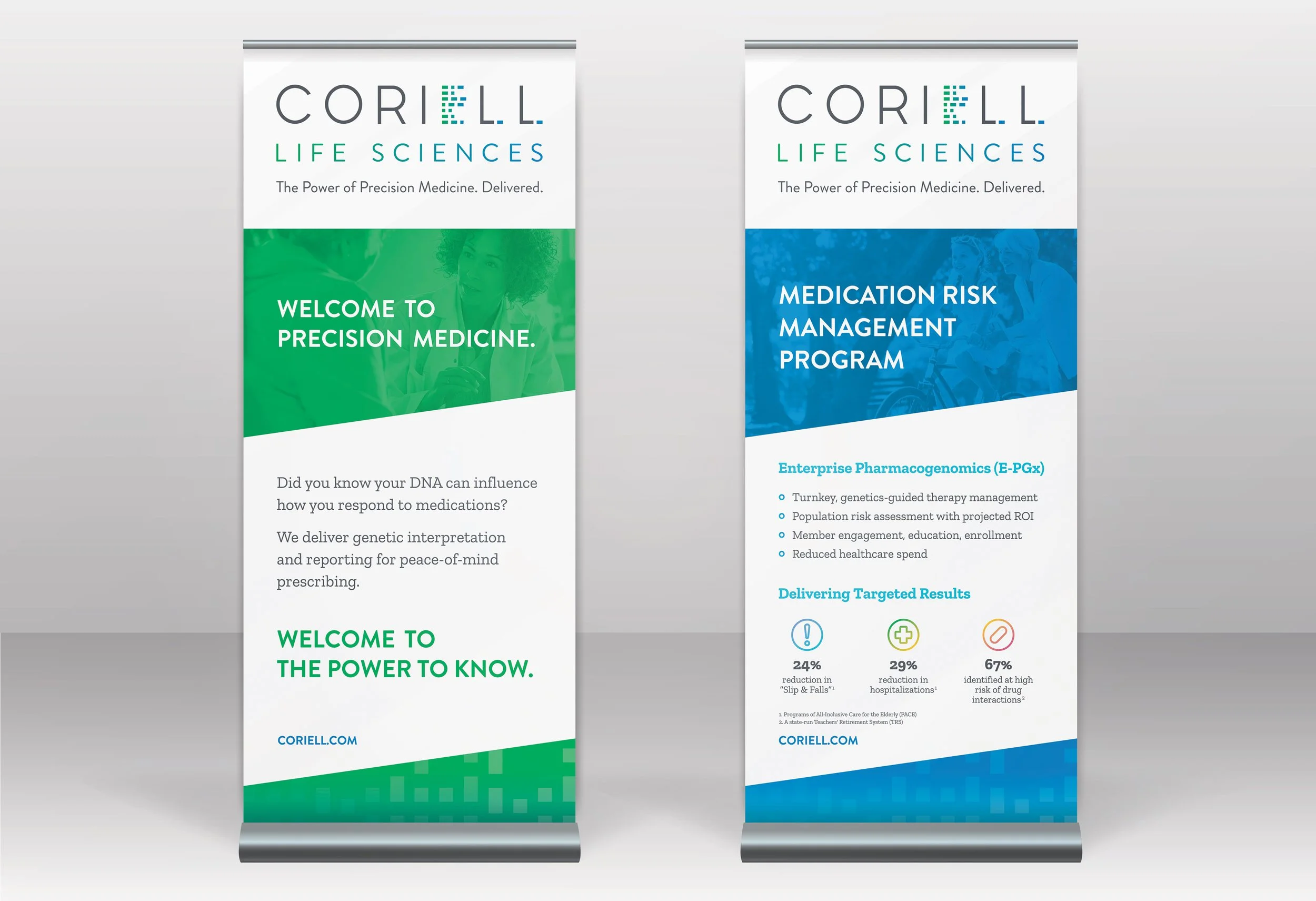
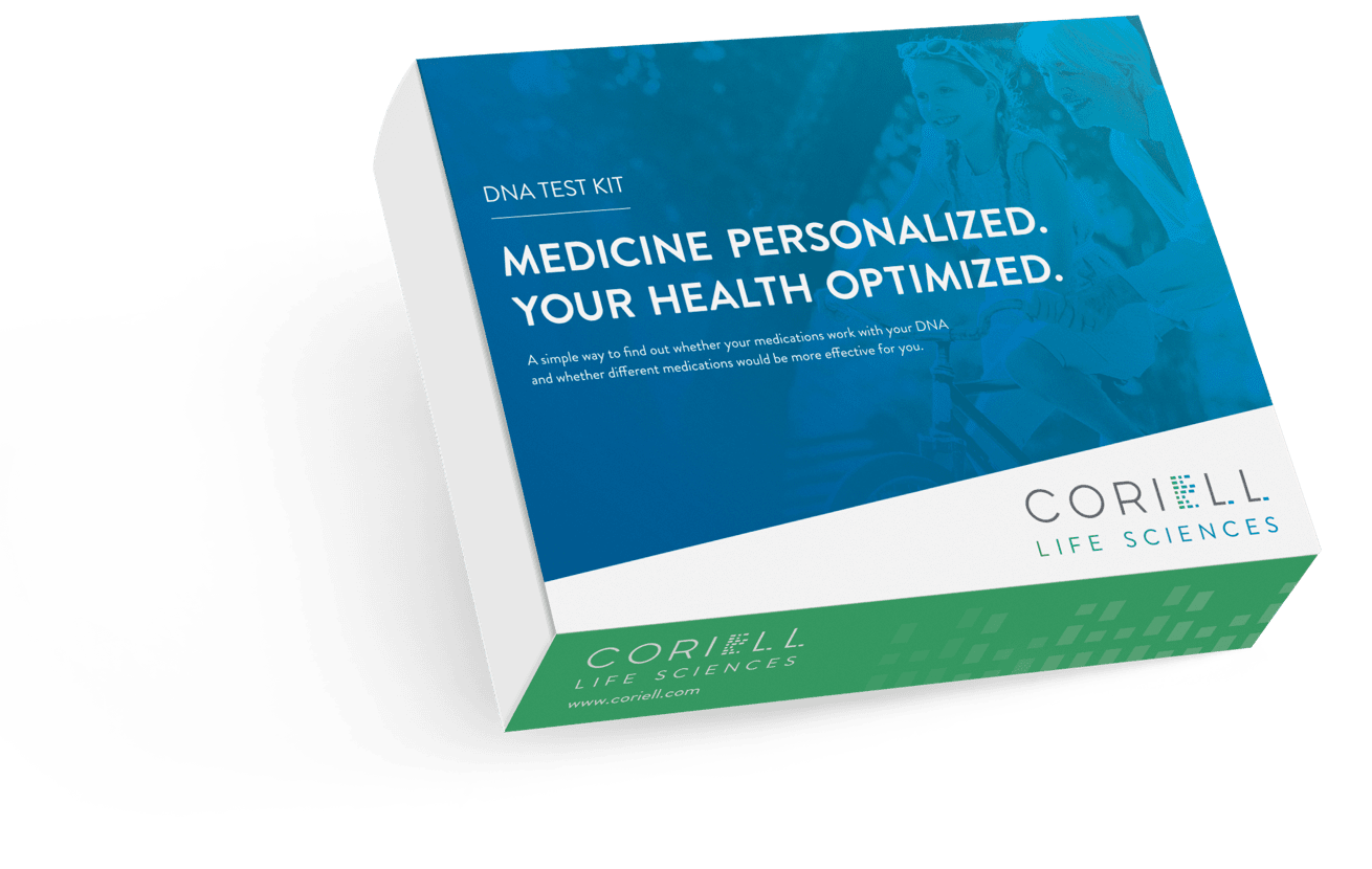
Packaging solutions were designed to be clean, informative, and professional, ensuring clarity in clinical and operational settings while reinforcing brand recognition. The designs balance regulatory seriousness with a modern aesthetic, helping complex testing products feel approachable and trustworthy.
-
Trade show assets were created to perform in busy, competitive environments where messaging must be understood quickly and from a distance. Large-scale graphics, modular layouts, and clear hierarchy were used to communicate Coriell Life Sciences’ value proposition at a glance, while maintaining alignment with the core brand system.
-
The final brand system positioned Coriell Life Sciences as a modern, credible leader in pharmacogenomic testing. With a cohesive identity spanning logo, packaging, and experiential marketing, the company gained a visual foundation that supports growth, differentiation, and trust across clinical, enterprise, and industry audiences.
-
Visual Design · Brand Identity · Art Direction
Brand Identity, Packaging & Trade Show Design.
Logo Design
Moodboard
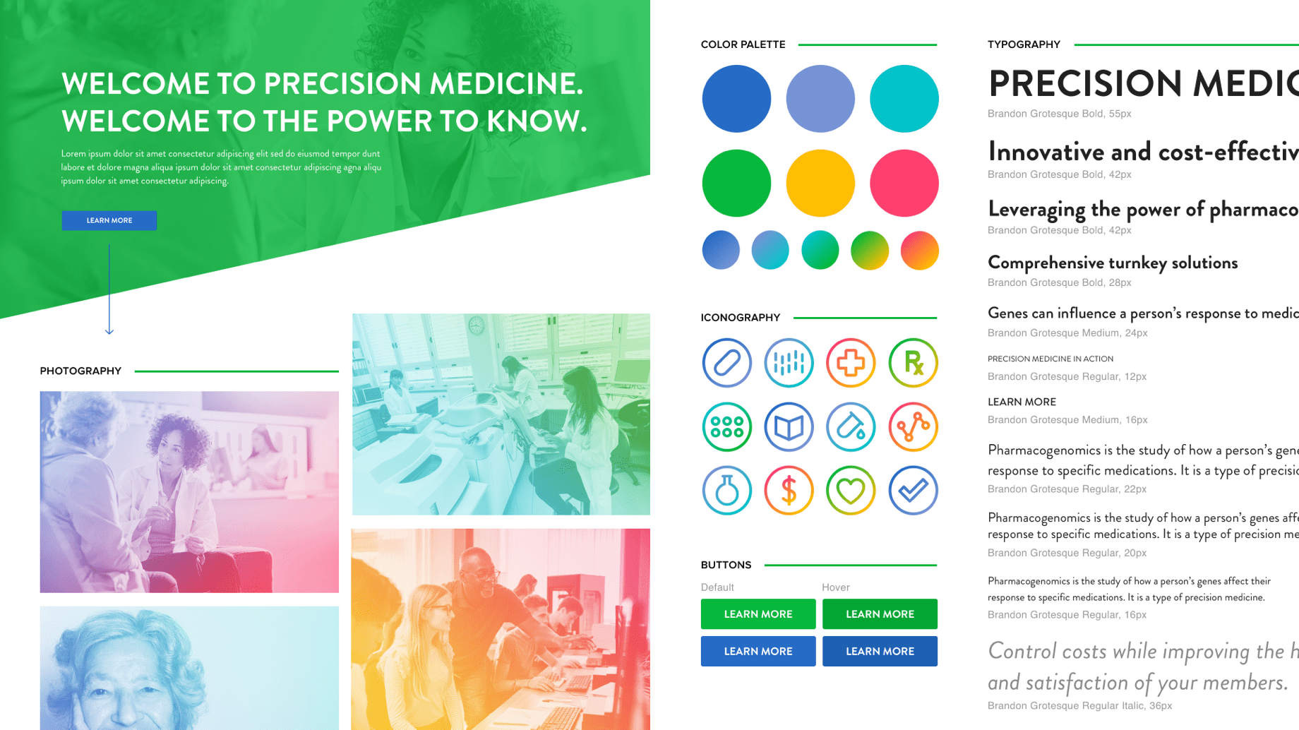
Iconography
Product Packaging
Tradeshow Display